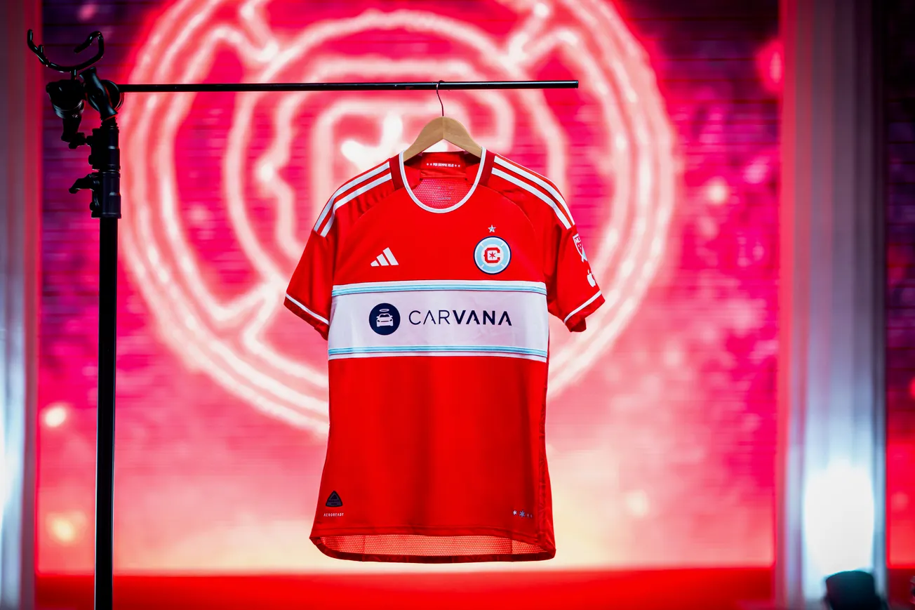
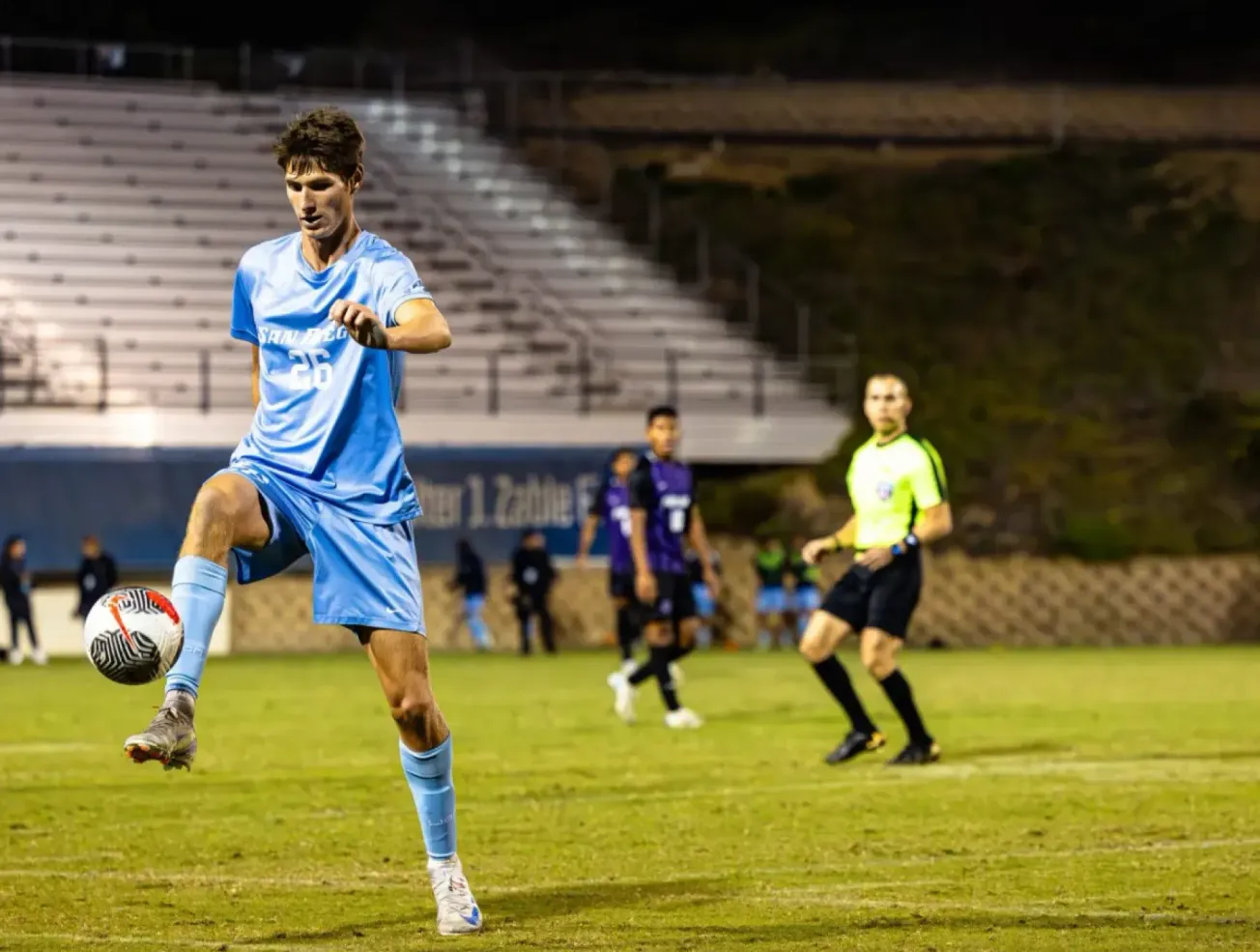
After years of waiting, the Chicago Fire returned to red in 2024. It closed one of the most bizarre chapters in Chicago sports uniform history, nearly on par with Bill Veeck’s attempt at making shorts proper baseball attire in 1976.
In stark contrast, the 2024 uniform combination gave one of the best looking pairings in modern MLS. The clean, classic red home shirt with the white chest stripe, reminiscent of the Blanco era paired with the “confetti” kit, a modern classic, gave fans a near perfect case of classic with a flair of modern that was begging to be worn outside of gameday.
Now in 2026, the Fire are expected to welcome two new uniform sets - a classic red home shirt, and a yet to be revealed third kit which may be part of the MLS Archive collection that was unveiled in 2025. Last season, ten different clubs released retro-inspired third shirts across MLS, some recalling old uniforms (Colorado Rapids, DC United), with others reverting back to the names they held when they entered the league (Dallas Burn, San Jose Clash). Some even pulled older crests onto the uniforms like the original Columbus Crew shield and the Seattle Sounders’ famous orca.
Now with the Fire set to join the ranks with a third kit of their own, the question is simple – which iconic look could they pull from?
Let's take a look through the archives and see which designs could be revisited in 2026.
2005 Chicago Flag third shirt (worn during friendly vs AC Milan)
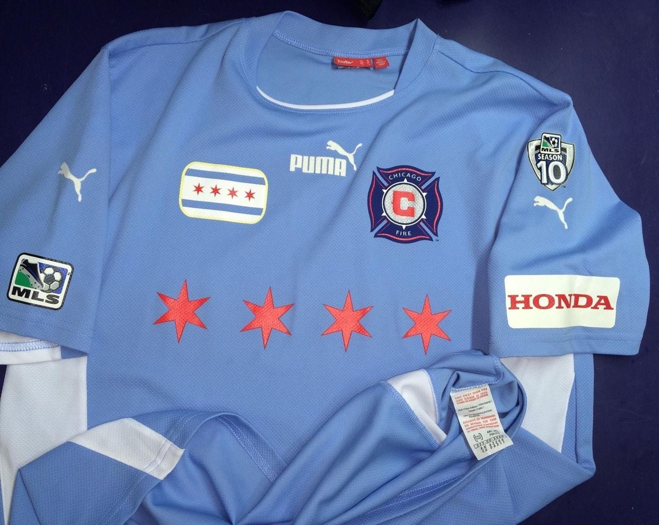
This is still, to me, the single greatest Chicago sports jersey ever worn. The simplicity, the use of the Chicago blue, the stars across the chest with the flag on the shoulder, it simply cannot be beaten. It’s iconic in that it screams Chicago in the loudest way while still being reserved enough to not blind you the moment you look at it. The white side striping and shorts add just the needed amount of contrast, even the Puma sponsor placement – it all just works.
Which is why it breaks my heart to say I think there’s almost no way we see this come back to life for the same reason we likely won’t see another red. The current away shirt also being light blue probably makes this a non starter, and the nail in the coffin is the similarity to the designs worn by a certain other pro soccer team in town (who were announced just one year after this kit was used) but it’s simply too good an option to leave off the list.
Back in black: the 2014-16 third shirt
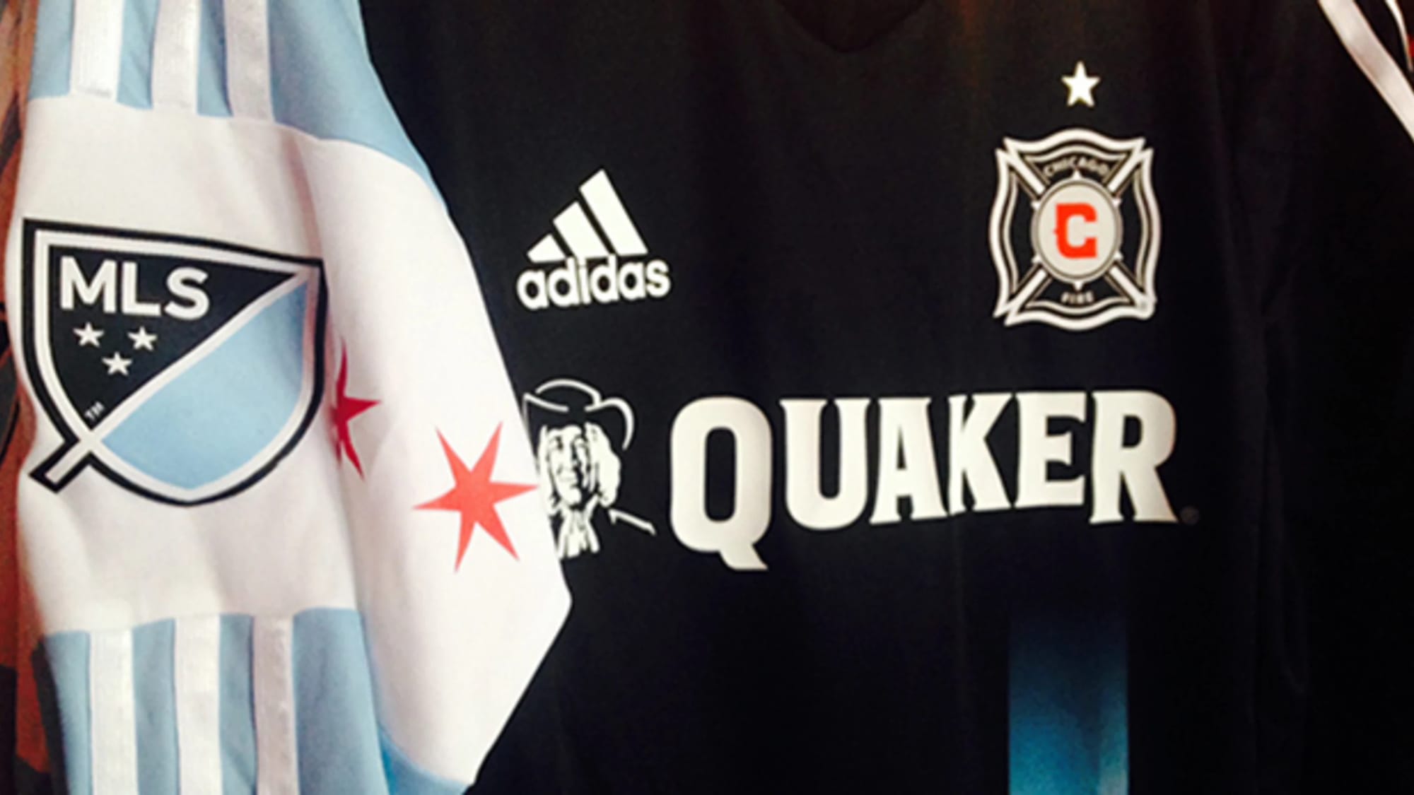
Another fan favorite, this three-year stretch remains the only time we’ve seen the Men in Red wear black in the nearly 30-year history of the club while being the strongest departure we’ve seen from an Adidas template. The piece speaks for itself. Chicago flag cuff on the right sleeve, and the sharp contrast of a Chicago blue stripe up the torso of the shirt, it’s arguably the most unique shirt we’ve ever seen from the Fire or Adidas for that matter.
As for my hesitancy to say it gets made, it’s another simple answer. This campaign seems focused on the 90s (or earlier) eras of MLS clubs, and a shirt from the mid 2010s simply doesn't fit the mold. If the club had had any real success in this shirt that could maybe sway things a bit, but I don’t see this being the choice.
The true throwback - Chicago Sting tribute kit
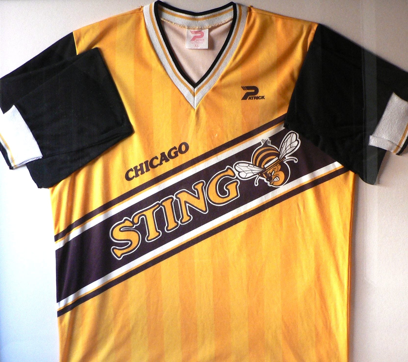
There are a few routes they could go with this idea, but I think the classic yellow with the sash would be the most likely – and the most iconic. It’s a real shame the Sting don’t have a stronger legacy in Chicago because they really do have one of the most fun brand legacies in American Soccer to me. They won two NASL championships, the first over the Franz Beckenbauer and the New York Cosmos in 1981 and the second over the Toronto Blizzards at Comiskey Park in 1984 before leaving NASL for MISL and eventually folding in 1988.
Calling back to a time when the final was still called The Soccer Bowl and many believed the future of the sport in North America was indoors, it would be great to see one of the forgotten champions of Chicago brought back to life in a more meaningful way than the brief merch run we saw from the Fire in 2024.
With that said, much of the former NASL's branding is now in a minefield of intellectual property rights and could prove to be too big a hurdle for a large scale merchandise push than it did for tees sold exclusively at matches on a specific day. That likely means that a true Sting retro kit is off the table, but we could see a similarly-styled and colored third kit using the Fire’s logo as an homage in 2026.
Finally, the trophy winner - the 1998 away shirt
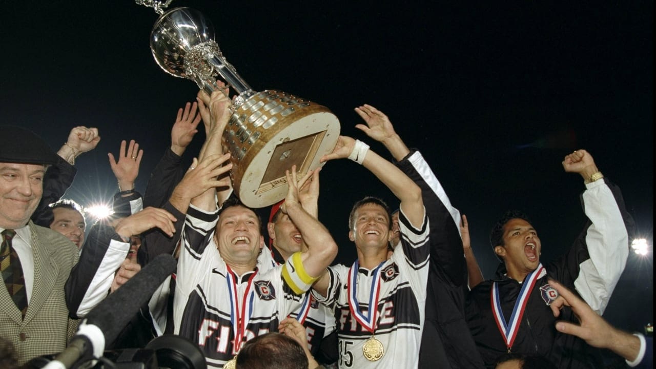
There’s only one team in MLS whose fans can sing “we came in with the double,” and I think it’s pretty likely that we will see that celebrated with the third shirt in 2026. While I suppose 2028 would’ve been the perfect time to do so, the schedule change and my own impatience would be glad to have this on the 28th anniversary instead of the 30th. This one hits all the marks. 90s heritage, starkly different from the other two uniforms to be worn, it has never been remade by the club, and it is still the centerpiece of the single most iconic photograph the club has to this day.
It’s a perfect storm of nostalgia, rarity, and frankly – just being an awesome shirt. While it won’t have that boxy, billowy frame we know and love from Frank Klopas’s iconic goal, it does seem to be a perfect match as the club once again looks to be the first to five.